
image-optimizer: generate AVIF, WebP and responsive images with a single command
You spend hours squeezing performance out of a site — optimizing fonts, deferring JavaScript — and meanwhile your images are sitting there at 800 KB without anyone batting an eye. Images are consistently the heaviest asset on a page, yet they remain the most overlooked part of a developer's workflow.
The good news: converting your PNG/JPG files to AVIF and WebP, and generating responsive variants, is not complicated. You just need the right tool integrated into your build process.
What is image-optimizer?
image-optimizer is an open-source PHP package installable via Composer. It automates the conversion of your source images (PNG/JPG) into modern optimized formats, with built-in responsive sizing and retina support.
In practice, a single command will:
- convert your files to AVIF (~50% lighter than JPEG at equivalent quality),
- generate WebP versions (~30% lighter),
- produce multiple width variants for every screen size,
- handle @2x/@3x density variants for retina displays.
Installing image-optimizer
Install the Imagick extension:
# Ubuntu / Debian
sudo apt install php-imagick

# macOS
brew install imagemagick && pecl install imagick
Install image-optimizer with Composer:
composer require --dev uxcode-fr/image-optimizer
Configuring image-optimizer
In a Laravel project, publish the configuration file:
php artisan vendor:publish --tag=image-optimizer-config
Here is an example configuration:
<?php

return [
    'source'      => 'resources/images',      // directory containing PNG/JPG source files
    'destination' => 'public/img',             // output directory
    'quality'     => [
        'avif' => 60,
        'webp' => 82,
        'jpg'  => 85,
    ],
    'formats'     => ['avif', 'webp', 'jpg'],  // output formats
    'densities'   => [1, 2],                   // screen density variants (retina @2x)
    'folders'     => [
        'hero'    => [1920, 1280, 768],        // widths generated for this folder
        'product' => [800, 400],
    ],
];
The folders key defines which widths to generate per subfolder. If a folder is not listed, image-optimizer will convert formats only — without resizing.
Generating the optimized images
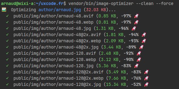
Run the command from your terminal:
vendor/bin/image-optimizer
Other useful options:
vendor/bin/image-optimizer --folder=product  # process a single folder
vendor/bin/image-optimizer --force           # regenerate even existing files
vendor/bin/image-optimizer --clean           # remove files with no matching source
Your optimized images are available in public/img/.
Using the images in your HTML
To serve modern formats with a proper fallback, use the <picture> element with <source> tags per format:
<picture>
    <!-- AVIF: best compression, growing browser support -->
    <source
        srcset="/img/hero/photo-1920.avif 1920w, /img/hero/photo-1280.avif 1280w, /img/hero/photo-768.avif 768w"
        sizes="(max-width: 768px) 100vw, 1280px"
        type="image/avif"
    >
    <!-- WebP: excellent support, great compression -->
    <source
        srcset="/img/hero/photo-1920.webp 1920w, /img/hero/photo-1280.webp 1280w, /img/hero/photo-768.webp 768w"
        sizes="(max-width: 768px) 100vw, 1280px"
        type="image/webp"
    >
    <!-- JPG: universal fallback -->
    <img
        src="/img/hero/photo-1280.jpg"
        srcset="/img/hero/photo-1920.jpg 1920w, /img/hero/photo-1280.jpg 1280w, /img/hero/photo-768.jpg 768w"
        sizes="(max-width: 768px) 100vw, 1280px"
        alt="Image description"
        width="1280"
        height="720"
    >
</picture>
The browser automatically picks the format it supports and the size that best fits the screen — no JavaScript, no library required.
Why use this solution?
- Performance: AVIF cuts file weight in half compared to JPEG, WebP by 30%. Direct impact on LCP and PageSpeed score.
- Built-in responsive: no more manual resizing. One source folder, multiple variants generated automatically.
- Zero runtime overhead: everything happens at build time. Your server just serves static files.
- Team consistency: every developer shares the same optimization settings, with no external tooling or implicit conventions.